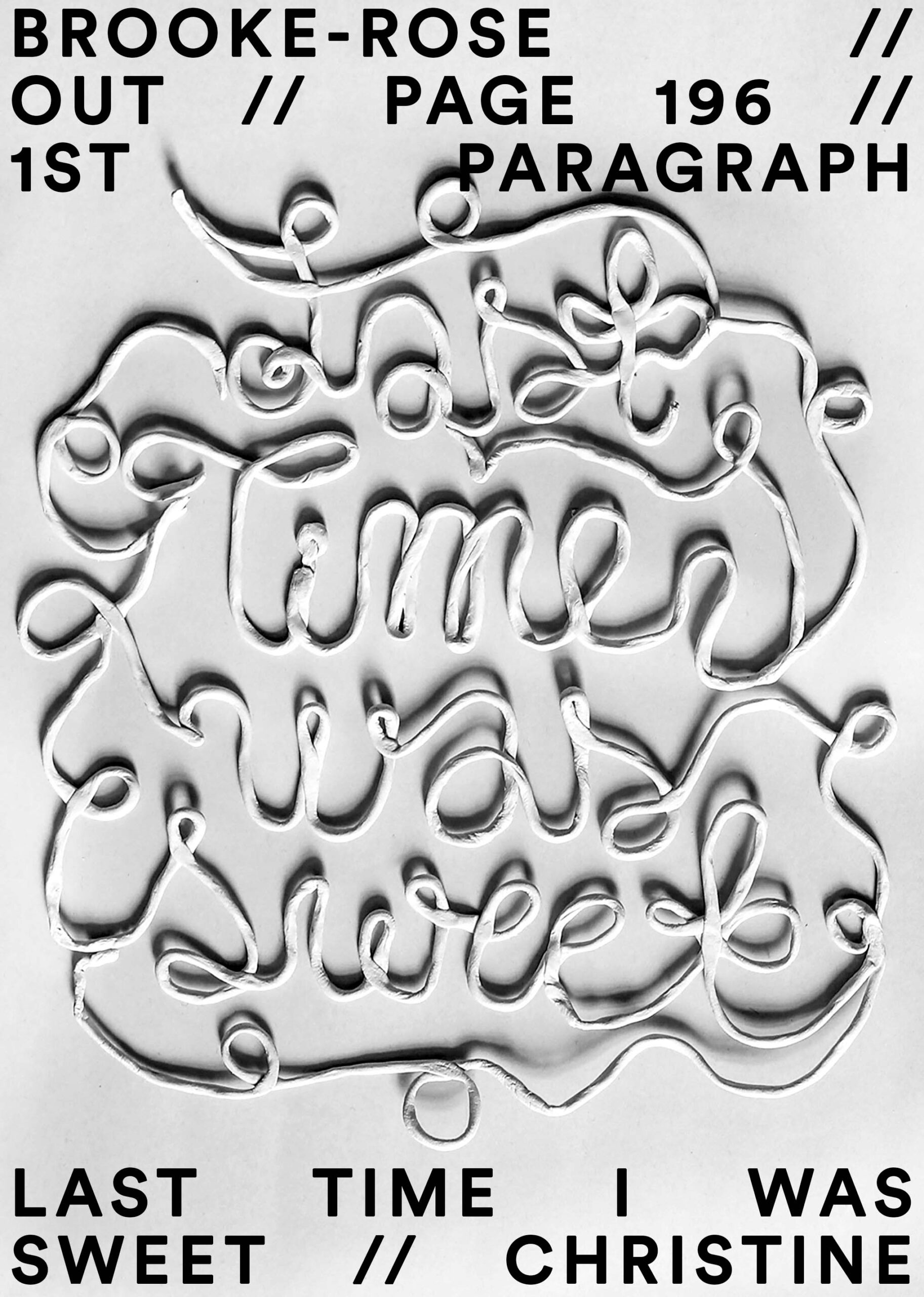
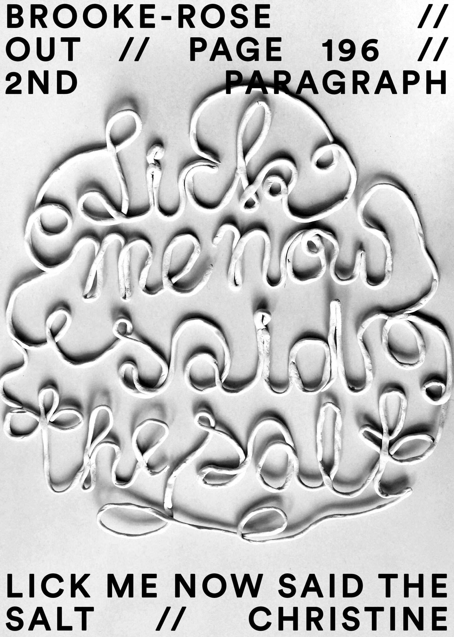
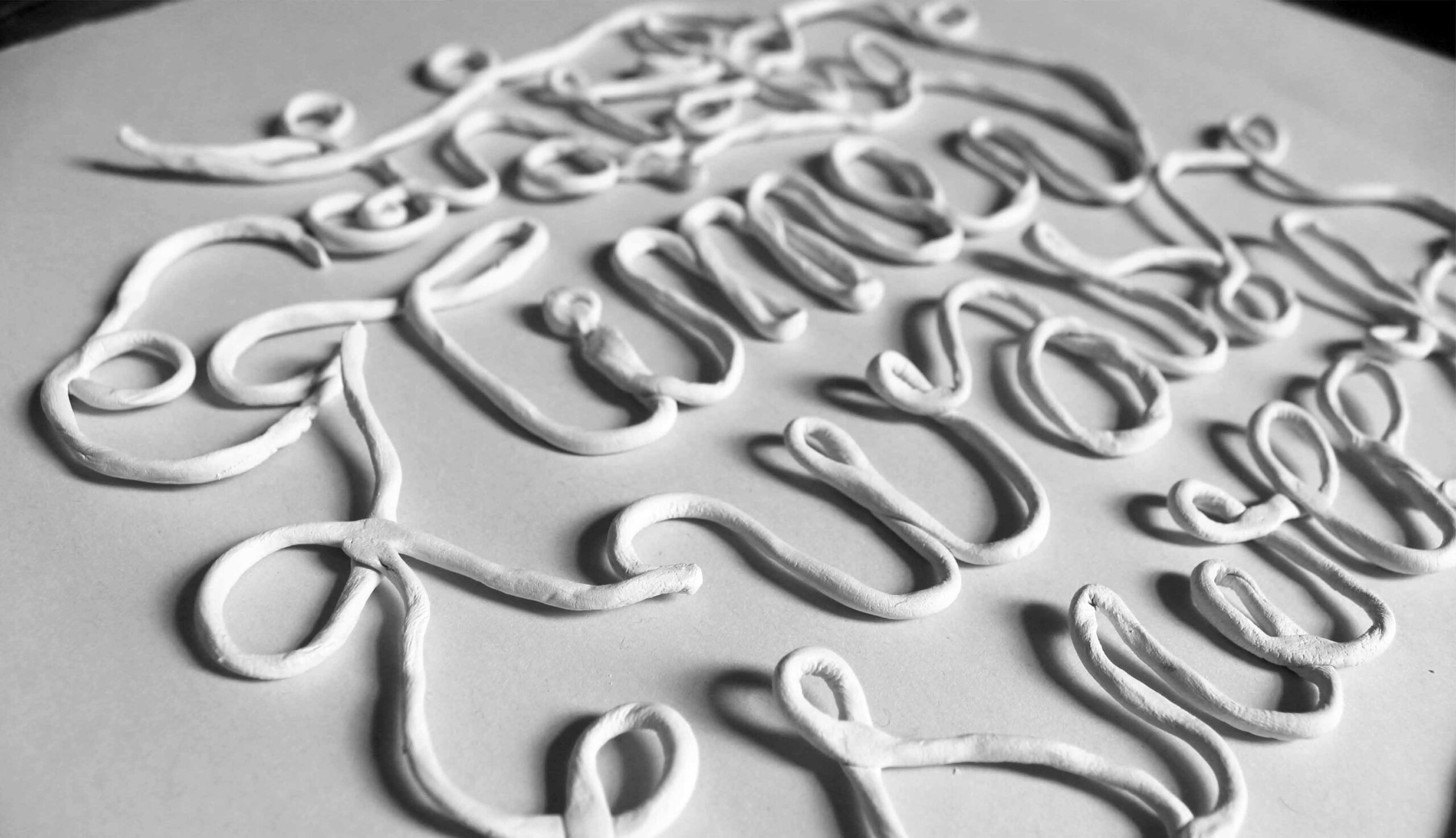
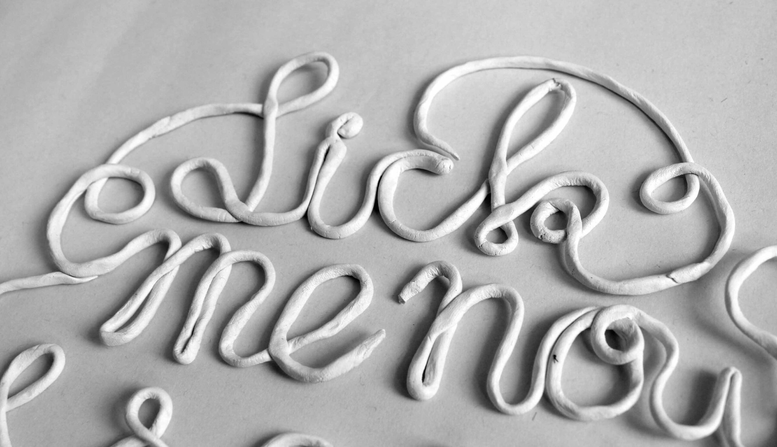
@font-face {font-family: 'Toren-Proportional';src: url('https://anikamohr.com/wp-content/uploads/2023/09/Toren-Proportional.otf') format('opentype');}@font-face {font-family: 'Toren-Rotalic';src: url('https://anikamohr.com/wp-content/uploads/2023/09/Toren-Rotalic.otf') format('opentype');}@font-face {font-family: 'Toren-Mono';src: url('https://anikamohr.com/wp-content/uploads/2023/09/Toren-Mono.otf') format('opentype');}
Doppelplakat-nahe

KERAMIK LETTERING

Bei diesem selbst initiierten Projekt habe ich mit dem Material Ton experimentiert, um von den haptischen und plastischen Reizen der analogen Methode zu profitieren. Das Material wurde zu langen dünnen Schlangen gerollt, anschließend zu Buchstaben geformt und fotografiert. Letztlich wurde aus dem digitalen Foto eine Plakatgestaltung.


Lettering & Plakatgestaltung, 
2019

Doppelplakat-nahe2
last-time
Lick-me-now
Cookie Consent mit Real Cookie Banner